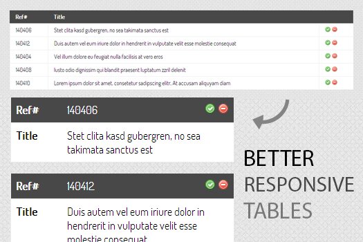
Better Responsive Data Tables
Responsive web design (often abbreviated to RWD) is a web design approach aimed at crafting sites to provide an optimal viewing experience—easy reading and navigation with a minimum of resizing, panning, and scrolling—across a wide range of devices (from desktop computer monitors to mobile phones).
While working on a responsive site or app, Responsive Data Tables are critical and there are many approaches available but nothing worked for me. Few of them are listed:
- http://css-tricks.com/responsive-data-tables/
- http://elvery.net/demo/responsive-tables/
- http://themergency.com/footable/
- http://mobifreaks.com/coding/responsive-data-tables-jquery/
Some of them rearranges the data, some hides the columns and some gives freedom to have all the data with a scrollbar or some simply just don’t look good and hard to read when viewed on smaller screens. So I decided to work on my own version.

Better Responsive Data Tables is my version of responsive data tables, I divide every table row into a separate data block and rearranges the information.
The code has no license, free to use, attribution not required but appreciated.
1 Response
[…] Kaynak: Better Responsive Data Tables […]