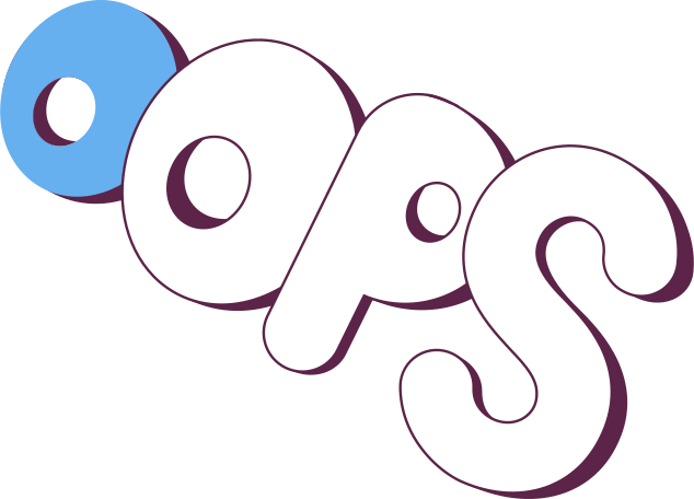
Fonts are an essential component of any design, and they can be used to convey a variety of messages. While many designers stick to traditional fonts, there’s a growing trend towards more playful and unique fonts, commonly referred to as “funky fonts.” In this article, we’ll explore what funky fonts are and how to use them to enhance your designs.
What Are Funky Fonts?
Funky fonts are unique typefaces that deviate from the traditional fonts used in most designs. They often feature bold, exaggerated lettering, and can be used to convey a sense of playfulness, whimsy, or rebellion. Some common examples of funky fonts include graffiti fonts, retro fonts, and even hand-drawn fonts.
Why Use Funky Fonts?
Funky fonts can be an excellent tool for designers looking to add some personality and flair to their designs. They can be used to create a distinct brand identity, convey a sense of fun and creativity, or simply make a design stand out from the crowd. However, it’s important to use them in moderation, as overusing funky fonts can quickly become overwhelming and distracting.
How to Use Funky Fonts
Here are some tips for using funky fonts effectively in your designs:
1. Choose the Right Font for the Job
Different fonts will convey different moods and messages, so it’s important to choose the right font for the job. Consider the overall tone and purpose of your design, and choose a font that complements that tone. For example, a hand-drawn font might be perfect for a children’s book, while a retro font might be more suitable for a vintage-inspired poster.
2. Pair Funky Fonts with More Traditional Fonts
To avoid overwhelming your design, consider pairing funky fonts with more traditional fonts. This can create a nice balance between playfulness and professionalism, and make your design more readable. For example, a retro font might look great when paired with a simple sans-serif font.
3. Use Funky Fonts Sparingly
While funky fonts can be a great way to add personality to a design, it’s important to use them sparingly. Overusing funky fonts can make a design appear cluttered and unprofessional. Instead, consider using them for headlines, titles, or other prominent elements, while sticking to more traditional fonts for body text.
4. Pay Attention to Legibility
While funky fonts can be fun and eye-catching, it’s important to ensure that they’re still legible. Avoid using overly ornate or intricate fonts that might be difficult to read, and make sure that the font size is appropriate for the design. Consider testing your design on a variety of devices and screen sizes to ensure that the font is easy to read.
Conclusion
Funky fonts can be a great tool for designers looking to add some personality and flair to their designs. However, it’s important to use them in moderation and pair them with more traditional fonts to ensure that your design remains readable and professional. With these tips in mind, you can use funky fonts to create designs that stand out from the crowd and convey a sense of creativity and fun.
FAQs
- What are some popular funky fonts?
Some popular funky fonts include graffiti fonts, retro fonts, and hand-drawn fonts.
- Can I use funky fonts for body text?
It’s generally not recommended to use funky fonts for body text, as they can be difficult to read. Stick to more traditional fonts for body text, and use funky fonts sparingly for headlines and titles.
- Are there any fonts I should avoid using?
Avoid using overly ornate or intricate fonts that might be difficult to read, particularly in small sizes.
- How can I ensure that my funky font is readable?
To ensure that your funky font is readable, pay attention to factors such as font size, spacing, and contrast. Use a font size that is appropriate for the design, and make sure that there is enough spacing between letters and lines. Additionally, ensure that there is enough contrast between the font color and the background to ensure readability.
- Can I use funky fonts in all types of designs?
Funky fonts can be used in a variety of designs, but it’s important to consider the overall tone and purpose of the design. For example, a funky font might not be appropriate for a professional business card, but it might work well for a playful children’s book cover.
