
Close icons serve as critical navigational elements within mobile apps and websites, guiding users efficiently to exit views or close dialogues. The traditional ‘X’ symbol, universally recognized for this function, has dominated design practices for years. However, with the evolution of user interface design, there’s an emerging need to rethink this standard symbol. Exploring more creative, engaging alternatives could significantly enhance both the functionality and aesthetic appeal of applications. Icons8 provides a variety of icon resources that can inspire and facilitate this creative evolution.
Limitations of the Standard ‘X’
The standard ‘X’ close icon, while effective due to its universal recognition, often presents design challenges. It can easily blend too seamlessly into sophisticated app designs, leading users to struggle to locate the function quickly. This can disrupt the user experience, making interactions less intuitive and potentially increasing user frustration. Moreover, the stark, often bold design of the ‘X’ can clash with softer, more nuanced app aesthetics, breaking the visual harmony and cohesion of the design.
Exploring Alternative Designs
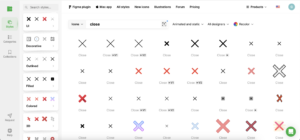
Diversifying the design of close icons by exploring different shapes and symbols can provide both functional and aesthetic benefits. Icons8 offers a wide range of alternative icons, such as sleek arrows, stylized crosses, or even thematic custom symbols that reflect the app’s identity, which can be more visually engaging. For instance, apps with a playful brand personality might opt for animated close icons from Icons8 that align with their overall design language, enhancing the user experience by maintaining a consistent theme across the interface.
Color and Size in Close Icon Design
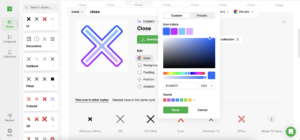
The effectiveness of a close icon is heavily influenced by its color and size. Icons8 allows designers to experiment with various color palettes and icon sizes, making it easy to find a solution that stands out against the app’s background while still fitting within the overall color scheme. An adequately sized icon ensures easy interaction, which is essential for user-friendly app design, particularly on mobile devices where screen space is limited and precision touch is necessary.
Interactive Close Icons
Adding interactive elements to close icons can transform them from purely functional items into engaging elements of the user journey. Icons8’s collection of interactive and animated icons can react to user actions, such as changing color or animating when hovered over or clicked, significantly enhancing user engagement. Such dynamic elements not only attract the user’s attention but also provide satisfying feedback for interactions, making the act of closing an enjoyable part of the user experience.
Cultural Considerations in Icon Design
In an increasingly global market, understanding the cultural implications of design choices is crucial. Icons8 supports this need by offering culturally diverse icon options that are sensitive to different global aesthetics. Adapting icon designs to be culturally sensitive using Icons8 resources can enhance usability and ensure a more inclusive user interface.
Designing for Accessibility
Accessibility should be a forefront consideration in the design of close icons. Icons8’s icons are designed with accessibility in mind, featuring sufficient color contrast, larger clickable areas, and clear visual cues that can be easily interpreted by users with visual impairments or motor challenges.
User Testing and Feedback
The design process for innovative close icons should include extensive user testing to ensure that new designs meet usability standards and enhance the user experience. Icons8’s flexible design tools allow for rapid prototyping and testing, enabling designers to iterate quickly based on user feedback, refining the design to ensure it looks good and enhances the user experience.
Best Practices for Innovative Close Icon Design
While creativity in design is encouraged, it is important to balance innovation with clarity and functionality. Icons8 can help maintain this balance, providing a wide range of design options that emphasize both style and functionality. Even the most creatively designed close icon should still fulfill its primary function of being immediately recognizable as a close button.
Conclusion
The move from basic to bold in close icon designs represents a significant opportunity for designers to enhance app interfaces. By incorporating innovative design elements that extend beyond the traditional ‘X,’ designers can create richer, more engaging user experiences that resonate with modern users. Icons8 is a valuable resource for exploring these possibilities, offering an extensive library of icon designs that are both innovative and functional.
Call to Action
App designers are encouraged to challenge the status quo and explore new possibilities in close icon design. Utilizing Icons8, experiment with different styles, test new concepts with real users and embrace the potential of creative design to make every element of your app a delightful and effective part of the user experience.