HTML5 CSS3 Boilerplate for Creating Mobile First Responsive Websites: Gridless
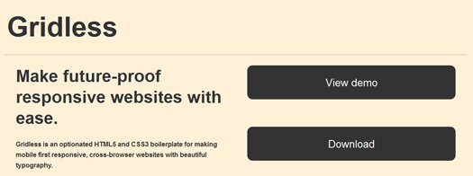
Gridless is an optionated HTML5 and CSS3 boilerplate for making mobile first responsive, cross-browser websites with beautiful typography.

Gridless takes the boring parts of making websites and webapps out. It comes packed with everything you’re tired of doing in every new project: CSS normalization, beautiful typography, a well-organized folder structure, IE bugfixes and other nice tricks.
Gridless uses mobile first responsive web design to adapt itself to the device’s width. This means it’ll work anywhere: old feature phones, newer smartphones, tablets, notebooks and bigger desktops. IE6/7/8 don’t support media queries, so we use Respond.js to polyfill that.
1 Response
[...] Gridless is an optionated HTML5 and CSS3 boilerplate for making mobile first responsive, cross-browser websites with beautiful typography . HTML5 CSS3 Boilerplate for Creating Mobile First Responsive Websites: Gridless | Greepit [...]