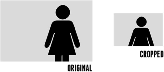
Intelligent Image Resizing and Cropping of Responsive Images: Focal Point
The concept of responsive images requires that any images on your page resize and reflow to achieve optimal layout for the current viewport size. What if you came across something that takes this idea a step further though and not only resizes your images, but crops them as well.

Focal Point is a handy little CSS framework that allows you to not only automatically resize your images when the viewport changes, but also crop the images with a specific important focal point in mind. Amazingly enough, it does all this with pure CSS.
Recent Comments