Responsive Layouts (Templates) For Email / Newsletters: Antwort
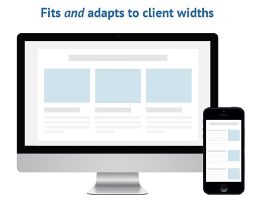
Antwort offers responsive template for emails & newsletters that fits and adapt to client widths. Don’t underwhelm desktop users with single column layouts that work for mobile. Antwort offers columns on desktop that automatically become rows on mobile.

Originally made for transactional Emails with dynamic content so the layouts are thoroughly tested – in live environments with real data and edge cases.
- Works in Outlook (2000+)
- Bulletproof layouts: made with dynamic content in mind
- Minimalist in design for maximum customization
Recent Comments