Sep
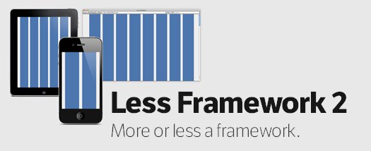
CSS Framework For Cross-Device Layouts: Less Framework 2
Everyone writes CSS differently. Less Framework takes this into account by having a minimal set of features, and does away with things like predefined classes. All it really contains are:
- A set of media-queries
- Typography presets aligned to a 24 px baseline grid
- And a grid, with its column sizes noted down within CSS comments

This CSS Framework uses inline CSS3 media-queries to switch between multiple layouts.
IE8 and below simply ignore everything inside inline media-queries. However, if you’d like IE to behave nicely, you can use something like css3-mediaqueries-js.
Categories:
Tags:


[...] This post was mentioned on Twitter by Frédéric Guerrier, Md Ilyas Ahmad. Md Ilyas Ahmad said: CSS Framework For Cross-Device Layouts: Less Framework 2 http://bit.ly/9jnmRH via @AddToAny [...]