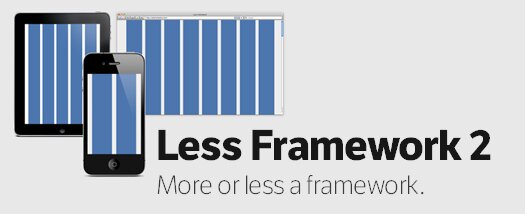
Everyone writes CSS differently. Less Framework takes this into account by having a minimal set of features, and does away with things like predefined classes. All it really contains are:
- A set of media-queries
- Typography presets aligned to a 24 px baseline grid
- And a grid, with its column sizes noted down within CSS comments

This CSS Framework uses inline CSS3 media-queries to switch between multiple layouts.
IE8 and below simply ignore everything inside inline media-queries. However, if you’d like IE to behave nicely, you can use something like css3-mediaqueries-js.

Pingback: Tweets that mention CSS Framework For Cross-Device Layouts: Less Framework 2 | Greepit -- Topsy.com
Pingback: An Ultimate Roundup of HTML / CSS Frameworks | Greepit