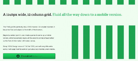
1140 Grid is a 12 columns Fluid CSS Framework that fits perfectly into a 1280 monitor. On smaller monitors it becomes fluid and adapts to the width of the browser.

Beyond a certain point it uses media queries to serve up a mobile version, which essentially stacks all the columns on top of each other so the flow of information still makes sense.

Faisal Mehmood
November 9, 2010 at 00:22This is really cool.
Pingback: Tweets that mention 1140px Wide Fluid CSS Framework: 1140 Grid | Greepit -- Topsy.com
Pingback: 1140px Wide Fluid CSS Framework: 1140 Grid | Greepit : : css
Pingback: 1140px Wide Fluid CSS Framework: 1140 Grid | Greepit | Programming Blog Imagik.org
Pingback: An Ultimate Roundup of HTML / CSS Frameworks | Greepit