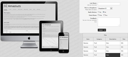
I am the kind of person who surf a lot on the Internet on many different displays – as large as my 1080p display screens to as small as 320×480 screen of my Xperia Mini. As an avid admirer of web design, one of the prime design factors that I want from websites is responsive layout – quick and clutter-free layout that works well on all display sizes. The idea of liquid or responsive layout is to design single design for all types of devices and displays.

Fortunately, achieving responsive layout design is not a big deal. There are a number of frameworks that provide built-in support for responsive layouts for websites and applications – just like Amazium. It is a lightweight and open source development framework that allows you to build standardized and responsive layouts using 960 grid system. The built-on support for 960 grid system makes Amazium exclusively different from other frameworks.


