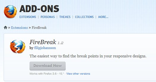
Are you still struggling when trying to find the break points of your responsive designs? Are you going insane because you just can not find that exact pixel where your design breaks? Install FireBreak, a free firefox extension and you will find those break points in no time!

Instead of using you mouse to resize the browser window you can now use your keyboard. Just hit Alt + Left Arrow to make the window 1px narrower and Alt + Right Arrow to make it wider. Throwing in the Shift key there as well will make it decrease and increase its width by 10px instead.
When you find your break point the tiny icon in the toolbar will tell you the exact width of you browser window.


