May
How to Design Accessible Websites and Web Applications
Done with your latest and the greatest web design?
Do you know that a large number of people in your audience would not be able to view your design as you intended. Imagine how a person with vision deficiency (like color blindness) would experience your website. According to an estimate, among adult computer users of the USA alone, 1 user in 4 has vision difficulty, 1 has dexterity problem and 1 in 5 has hearing problem. By ignoring these users, we not only reduce the number of users but also limit the scope of our products.
Today’s post is all about designing accessible websites/ web applications. Accessibility is the measure of ease with which users with physical disabilities, say visual impairment, can use a product efficiently and perform the required tasks satisfactorily. In other words, accessibility means that every user in his own context can operate a system and get required output without any constraints.
Here, it is very important to understand that many end-users may be using the product in a context that is very different from the context in which it is designed. For example,
- The user may not be able to see, hear, move, or may not be able to process some types of information easily or at all.
- The user may have difficulty reading or comprehending text.
- The user may be colorblind.
- The user may not have or be unable to use a keyboard or mouse.
These and many other contexts should be taken care of when designing or developing a system. The following is a set of basic rules of accessibility that you should understand and comply with when designing websites or web applications.
Use Colors Wisely

Do not rely on color alone to communicate a message. Ensure that text and graphics are understandable when viewed without color. If designers depend on color to convey information, colorblind users and users with devices that have non-color or non-visual displays cannot receive the information. Also ensure that foreground and background color combinations provide sufficient contrast when viewed on monochrome display or by someone with visual impairments.
Text Equivalents

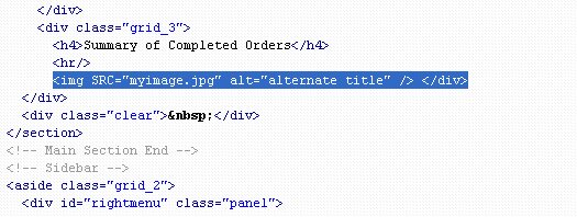
Provide alternative text – For each image or image link, provide alternative text using appropriate attributes like alt and longdesc. Screen readers and talking browsers use alternative to describe an image to the users who cannot access the image, such as the blind users. Use short and clear alternative text for images that carry important information.
Provide multimedia synchronization – For any time-based multimedia presentation (e.g., a movie or animation), synchronize equivalent alternatives (e.g., captions or auditory descriptions of the visual track) with the presentation.
Consider Flickering
Avoid unnecessary graphic effects. Design pages that do not cause the screen to flicker with a frequency greater than 2 Hz and lower than 55 Hz. People with photosensitive epilepsy may face problem due to flickering or flashing between 4 to 59 flashes per second (Hertz) range with peak sensitivity at 20 flashes per second. When a page includes moving content, provide a mechanism within to control moving/flashing objects.
Design Device Independent Pages
Design for device independence by using features that enable activation of page elements by a variety of input devices. Users should be able to interact with the Web site using a preferred input (or output) device. The input device may be a mouse, keyboard, voice etc.
Design Accessible Forms
Electronic forms contain a number of elements that require user interaction such as input fields, push button, radio button, check box, CAPTCHA etc. Design electronic forms in a way that people using assistive technology can access the information, field elements, and functionality required for completion and submission of the form.
Handle Time Outs

Accessibility problems can occur if your Web page times-out while a user is completing a form. Pages designed to comply with security requirements or reduce load on server may cause accessibility problem. These types of pages disappear or expire if a response is not received within a specified amount of time. Remember, that not all users are able to read or understand the page with equal efficiency. Always notify the user if a process is about to time-out. Also provide a prompt asking whether additional time is required.
Provide Options to Skip Navigation Links
Navigation links are usually placed at the top, bottom, or side of every new page. This creates difficulty for persons using a screen reader because screen readers move through pages by reading from top to bottom. The use of repetitive navigation links forces persons with visual impairments to re-read these links when moving to every new page. To counter this problem, Provide “skip navigation” tools that enable a user to move to the main content of a Web page without having to hear unnecessary information first.
Use Markup and Style Sheets Properly

Create web pages that can be read without style sheets. For example, when an HTML document is rendered without associated style sheets, it must still be possible to read the document. Use style sheets to control layout and presentation instead of elements and attributes.
Provide Text-Only Page
Provide a text-only page with complete information and functionalities as alternative to primary page. Remember, text-only page should be the last resort. Also make sure that the text-only page is updated whenever the primary page changes.
Scripts and Plugins
Text Equivalents – Ensure that plugins, scripts and other objects on a web page are accessible to users who need assistive technologies like page readers. Design web pages in a way that these are useable when scripts, applets or other objects are not supported. If this is not possible, at least provide text equivalents of these objects.

Alternatives – When a web page requires that a plug-in or other application be present on the client system to interpret page content, the page must provide a link to a plug-in or applet that can be interpreted through assistive technologies.
Tables
Identify Headers: In data tables, identify row and column headers. For example, use TD to identify data cells and TH to identify headers.
Use Markup: For data tables with two or more logical levels of row or column headers, use markup to associate data cells and header cells. For example, use THEAD, TFOOT, and TBODY to group rows, COL and COLGROUP to group columns, and the “axis”, “scope”, and “headers” attributes, to describe more complex relationships among data.
Identify Frames
For proper navigation through frames, identify each frame with suitable title. For example, use title attribute on Frame elements. If required, describe the purpose of frames and their relation by using longdesc attribute.
Please note that a website or any web based interface that is optimized for accessibility may not comply with some functional requirements and vice versa. Therefore, functional requirements of the product must be kept in mind at every stage of design and development and appropriate guidelines should be followed accordingly.
Stay Updated
Did you find this post useful? Please consider subscribing to our Full RSS Feed. Stay updated by following us on Twitter and Facebook.
About Author
Categories:
Tags:


Thanks for sharing information.
Thanks for posting this! I’m looking for a medium that can help us to get a good amount of promotion for my websites which in return gave me a business too through websites and I must say this has definitely helped me in this process.