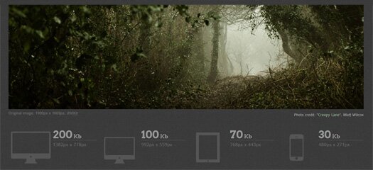
Is your site being increasingly viewed on smaller, slower, low bandwidth devices? Your desktop-centric images load slowly, cause UI lag, and cost your visitors un-necessary bandwidth and money? You’ve implemented a responsive design in CSS, and need something to adapt your images too?
Adaptive Images automatically adapts your existing HTML images for mobile devices. No mark-up changes needed. Just drop it in and forget about it.

Major Features
- Works on your existing site
- Works with any CMS, or no CMS
- Works on your server, not the cloud
- Easily configurable
- Device agnostic
- Adheres to a mobile-first philosophy
- Up and running within minutes


